Client and context
The Stemax case is about “brand identity for a shipping company”; the client is a shipping company.
Solution
Brand identity
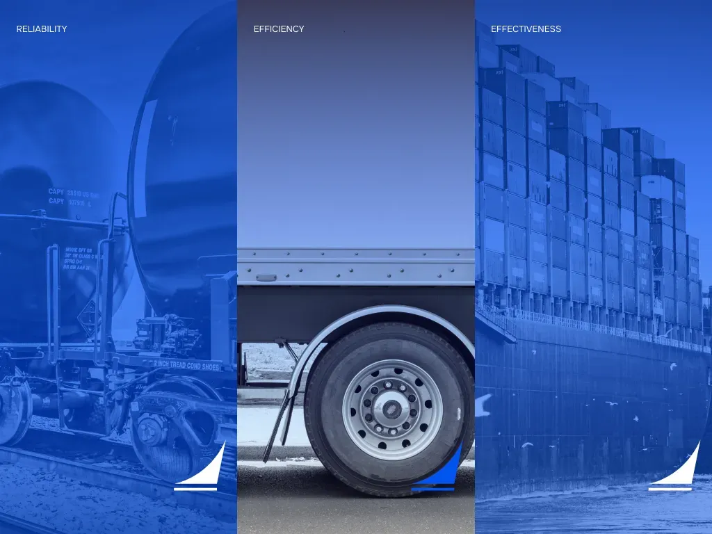
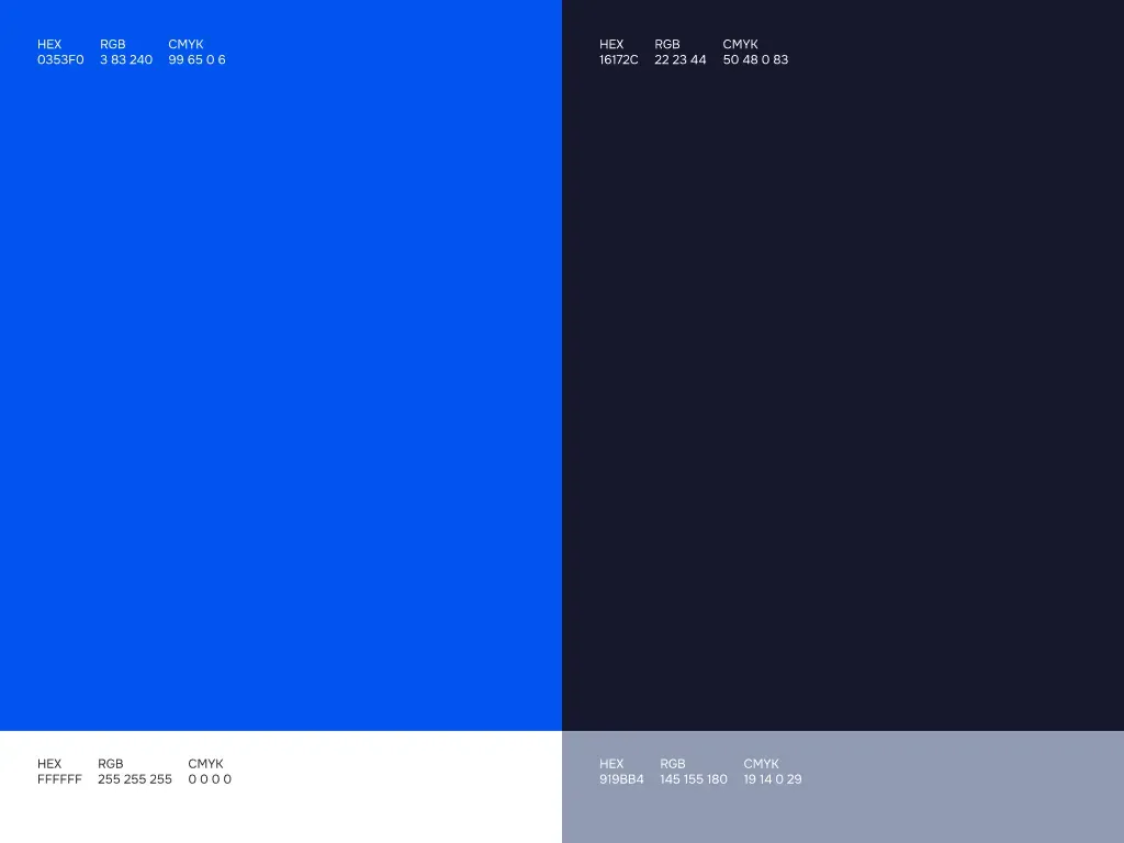
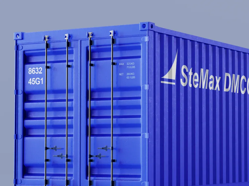
The basis is a brand symbol, a rich blue palette and concise typography. In the presentation the identity is shown on printed materials, containers, vehicle surfaces and a flag. For vehicle applications, versions of the symbol on blue and light backgrounds are provided.
Website
We designed a website with desktop and mobile screens for the logistics company Stemax. The structure shows the services, the geography of presence and information about transportation. For the interface we assembled a design system with grids, colours, sizes and element hierarchy. The project covered the full web development cycle — design, responsive front-end build and implementation of the site.
Scope of work
Logo and branding · colour and graphic system · printed materials · layouts for vehicle and container branding · UX/UI website design · desktop and mobile versions · UI kit and design system · pages about transportation and geography · responsive front-end build · website development
Result
The Stemax brand book collects the logo and graphic system for print, vehicles and containers. The website layouts, UI kit and responsive screens were delivered separately. In addition to the layouts, the responsive front-end build and website development were done.